FREE ACCESS Any active DecentTrader subscription gives you full access to Project Alpha Terminal Get Access →

Professional Crypto
Trading Intelligence

Advanced charting, AI-powered signals, on-chain analytics, ETF flow tracking, and real-time news — all in one platform.

Open Trading Terminal Explore Features
50+
Trading Pairs
5,300+
ETF Addresses
24/7
Live Monitoring
50+
Indicators
Platform

Everything You Need

A complete suite of tools for serious crypto traders and analysts.

Trading Terminal

Advanced Charting & AI Trading

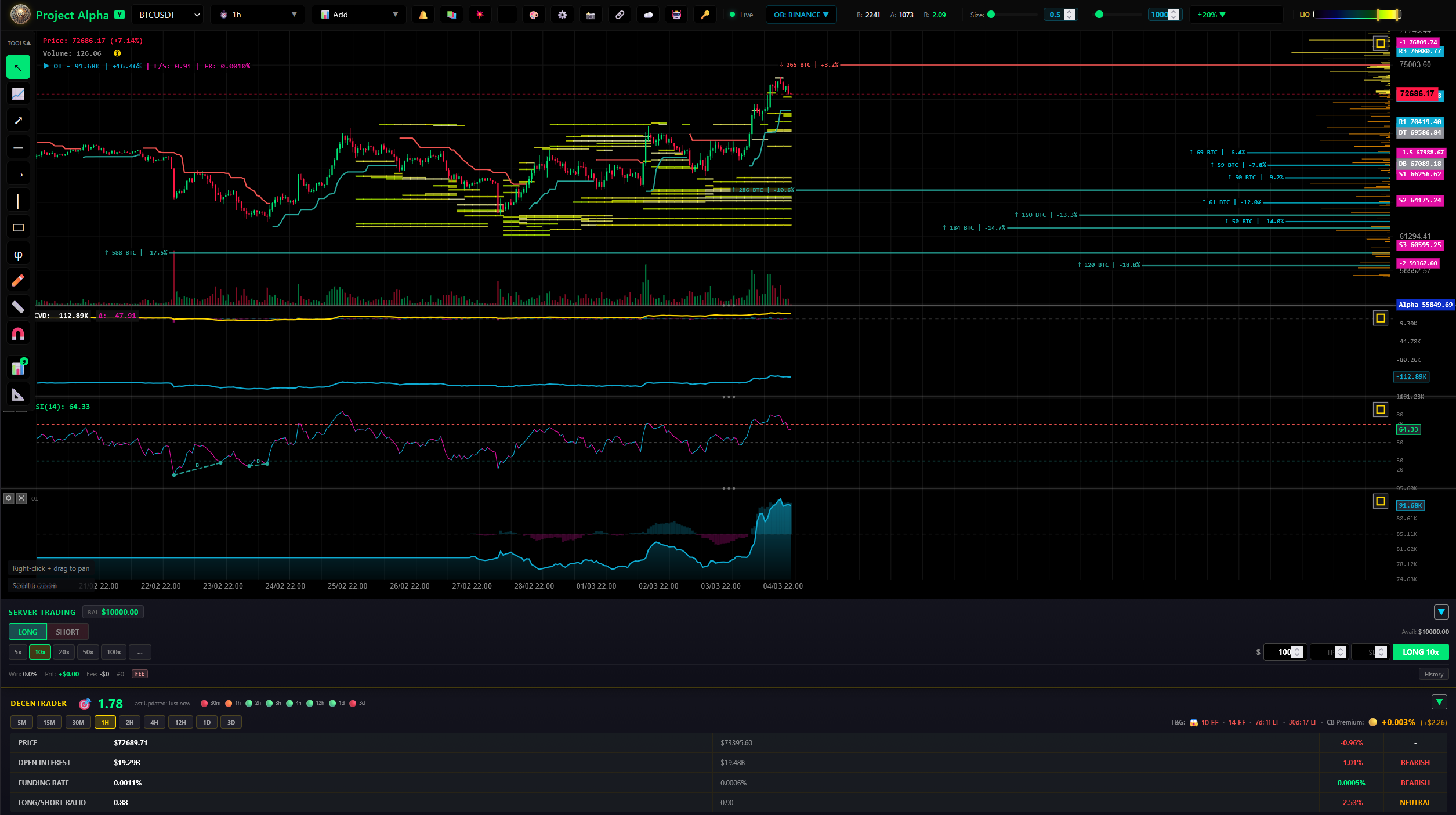
Custom-built canvas chart engine with real-time Binance data, professional drawing tools, and AI-powered trading signals.

  • Real-time candlestick charts with 15+ timeframes
  • RSI, MACD, SuperTrend, ADX, OBV, Volume Profile
  • Orderbook heatmap & liquidation monitoring
  • DecentTrader integration & market analytics
  • AI signal detection with divergence analysis
  • Paper trading & automated trade execution
  • Price alerts with Telegram & Discord notifications
  • Drawing tools: trendlines, rectangles, Fibonacci
Open Terminal
Trading Terminal
Alpha AI Assistant

Alpha AI Assistant

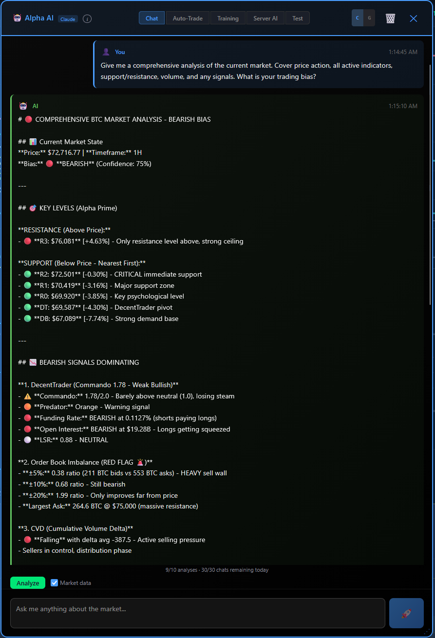
AI-powered market analysis with Claude & OpenAI. Get comprehensive breakdowns of price action, indicators, key levels, and trading bias in real-time.

Price Alerts

Smart Alert System

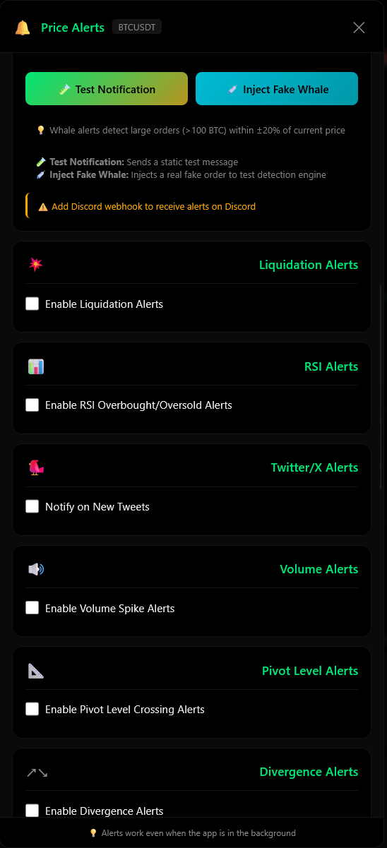
Liquidation alerts, RSI overbought/oversold, volume spikes, pivot levels, divergence detection, and X/Twitter notifications — all in one panel.

Auto Trading & Backtester

Auto-Trade & Backtester

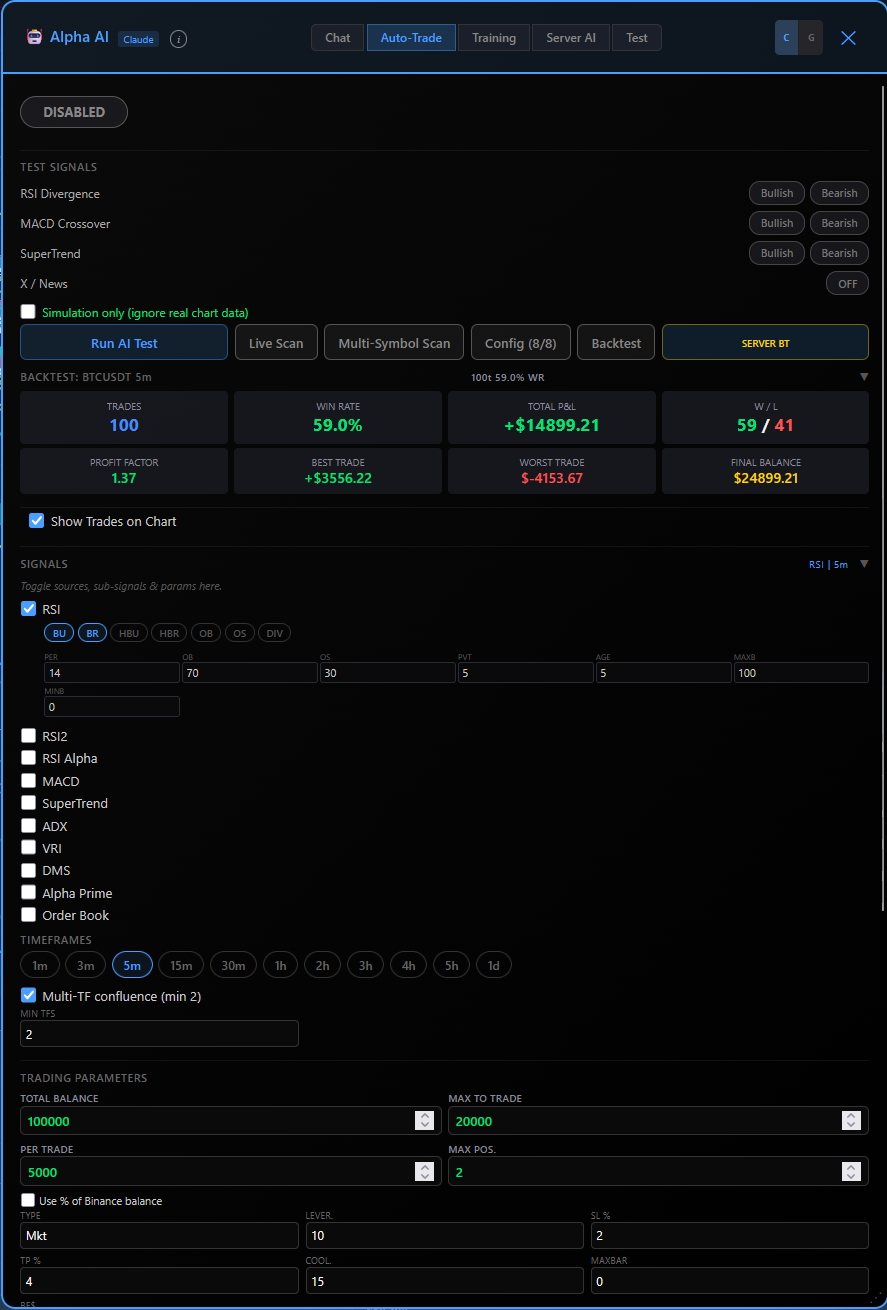
Configure AI signal sources, risk parameters, and indicator settings. Backtest strategies on historical data before going live with paper or real trading.

Machine Learning Alpha

MLA — AI Trading Engine

Probabilistic decision engine that identifies high-probability trading opportunities using historical pattern recognition and real-time market conditions. Not prediction — edge detection.

  • Outcome-based learning trained on real trade results
  • Confidence-weighted signals with probability scoring
  • Multi-timeframe structure analysis (1H + 5m)
  • Automated position management with TP/SL
  • Live performance tracking: PnL, win rate, profit factor
  • Discord notifications for trade open/close events
  • Walk-forward validated across multiple time periods
View MLA Dashboard
MLA V4 Trading Panel
MLA Live Trades

Live Position Visualization

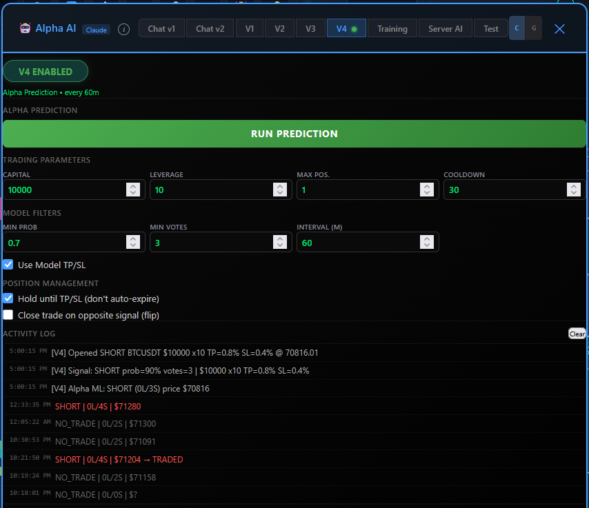
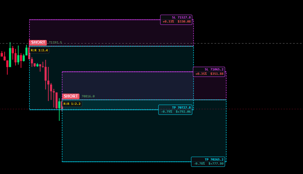
See active trades directly on chart with entry, TP, SL zones, R:R ratios, and real-time PnL. Full transparency on every position.

Trade Performance

Performance Dashboard

Real-time equity curve, daily PnL breakdown, win/loss ratios, and profit factor. Track every trade with full transparency.

AI Analysis

Intelligent Signal Processing

Confidence-weighted decisions filtering out noise. Outputs only high-probability setups with structured risk levels.

On-Chain Analytics

Bitcoin On-Chain Intelligence

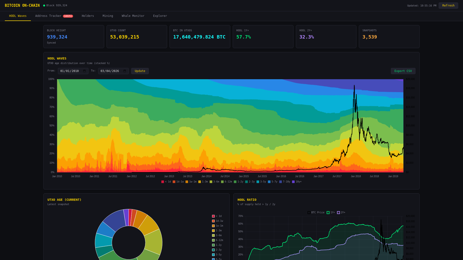
Deep blockchain analysis powered by a full Bitcoin Core node with UTXO scanning and real-time block monitoring.

  • HODL Waves — UTXO age distribution over time
  • Address Tracker with 5,300+ labeled addresses
  • Whale transaction monitoring (100+ BTC)
  • Exchange & ETF flow detection
  • Mining rewards & hash rate analytics
  • Holder distribution breakdown
View On-Chain Data
On-Chain Analytics
ETF Flow Tracker

Bitcoin ETF Flow Analysis

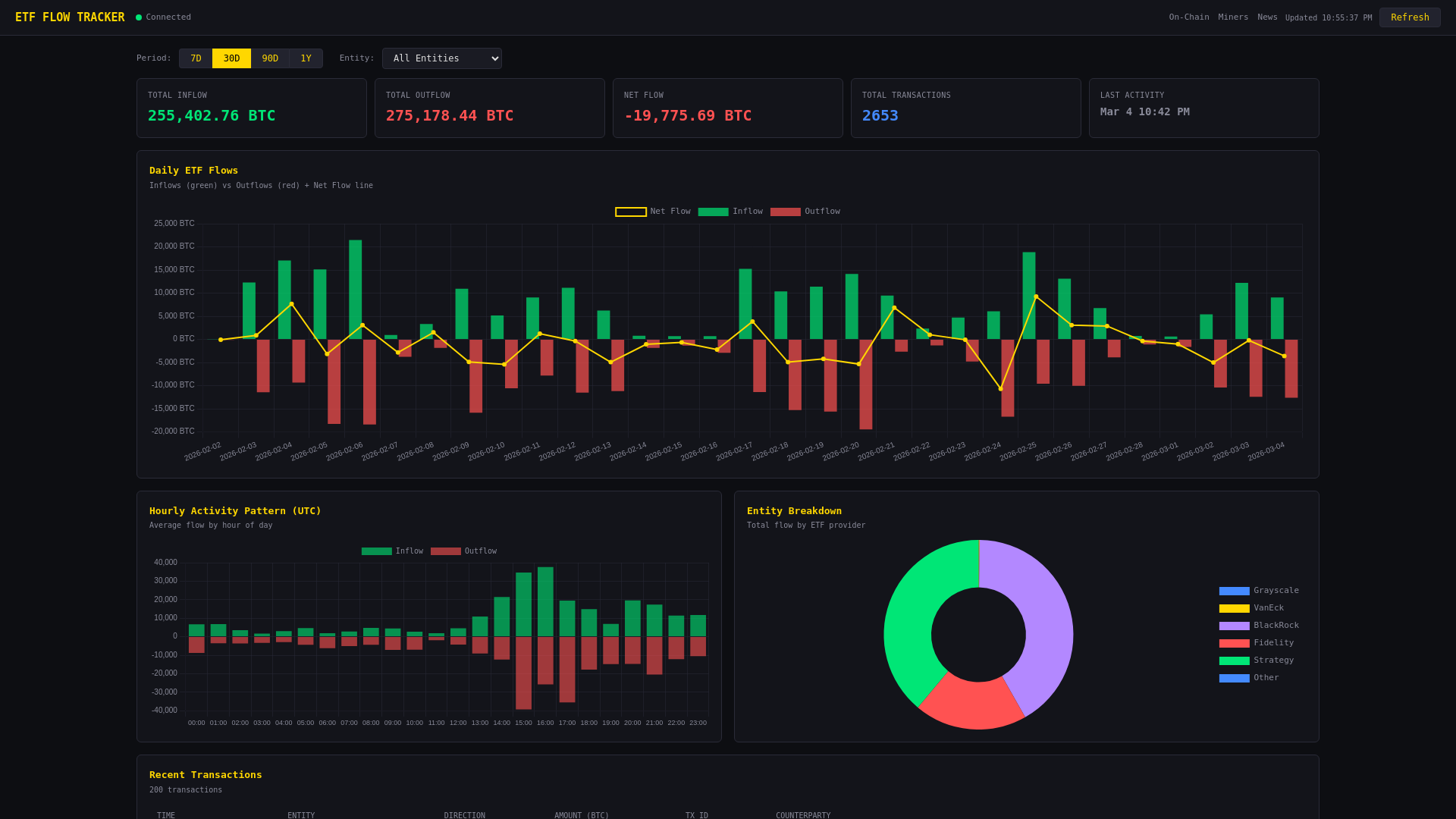
Track real-time Bitcoin inflows and outflows across major ETF providers with entity-level breakdown.

  • BlackRock (IBIT), Fidelity (FBTC), Grayscale (GBTC)
  • VanEck, Strategy (MicroStrategy) tracking
  • Daily & hourly flow charts with net flow overlay
  • Entity breakdown pie chart
  • Recent transactions with weekly summaries
  • Direction detection: inflow, outflow, internal
View ETF Flows
ETF Flow Tracker
News Intelligence

Real-Time Crypto News & X Feed

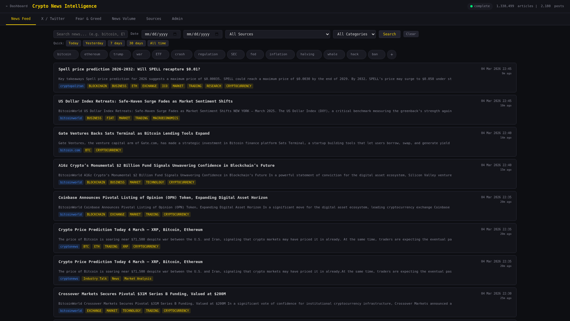
Aggregated news from top crypto sources and live X/Twitter feed from key market accounts.

  • Multi-source news aggregation with sentiment tags
  • Category filtering: BTC, ETH, DeFi, Regulation
  • X/Twitter feed from DeItaone, Cointelegraph & more
  • Full-text search across articles and tweets
  • Bookmarking and article tracking
  • Auto-refresh with real-time updates
Read News
News Intelligence
Market Cycles

Bitcoin Halving Cycle Analysis

Compare the current cycle against previous bull markets with price overlays aligned by halving date.

  • Bull market cycle comparison (2013, 2017, 2021, 2025)
  • Cycle ROI tracking — how many X from halving price
  • Drawdown from cycle peak comparison
  • BTC all-time price history with halving markers
  • Cycle statistics: peak ROI, days to peak, bottom drawdown
  • Bear market bottom prediction based on diminishing severity
View Market Cycles
Bitcoin Market Cycles
Cycle Statistics & Prediction

Cycle Statistics & Bear Market Prediction

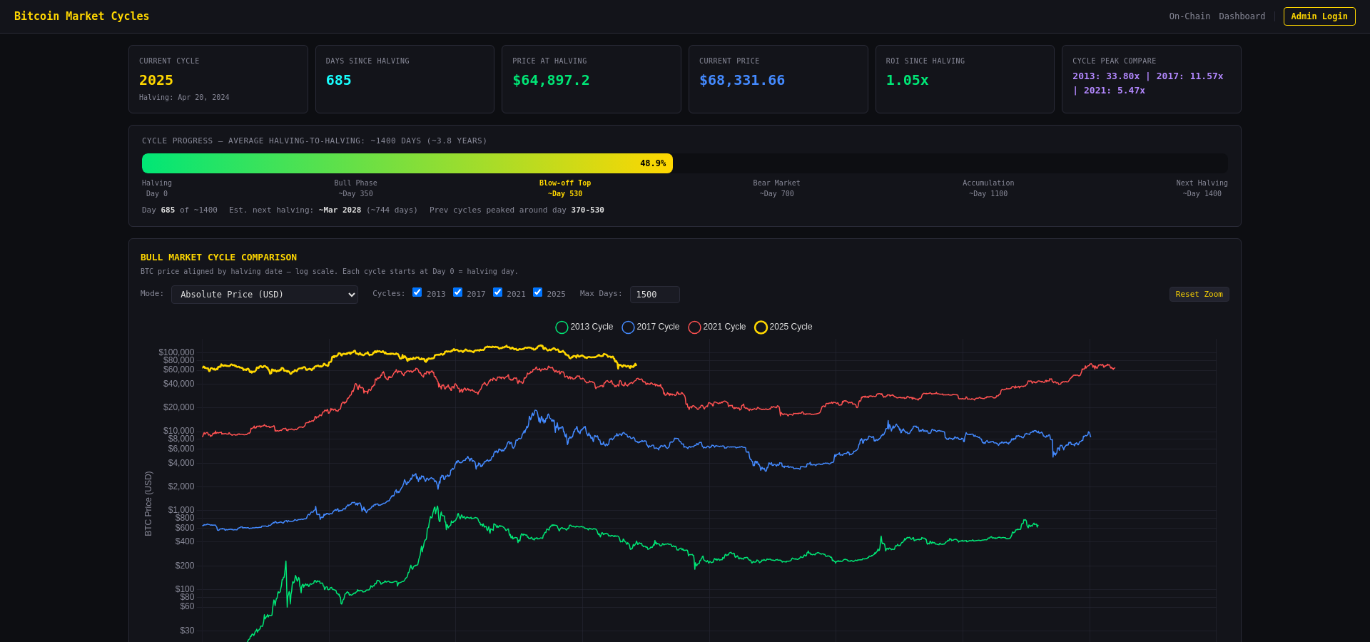
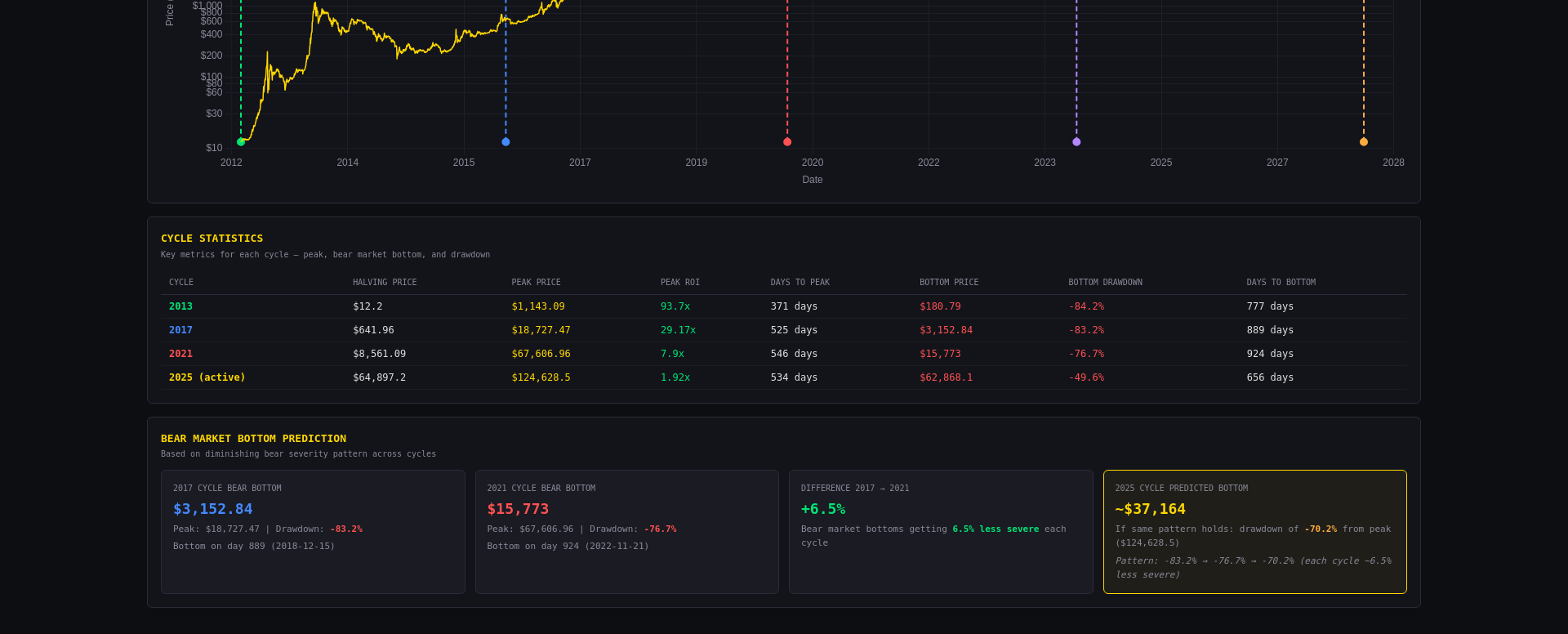
Historical cycle data with halving price, peak price, peak ROI, drawdown, and days to peak/bottom. Includes a bear market bottom prediction model based on diminishing severity across cycles — each bear market gets ~6.5% less severe.

Whale Trades

Real-Time Whale Trade Tracking

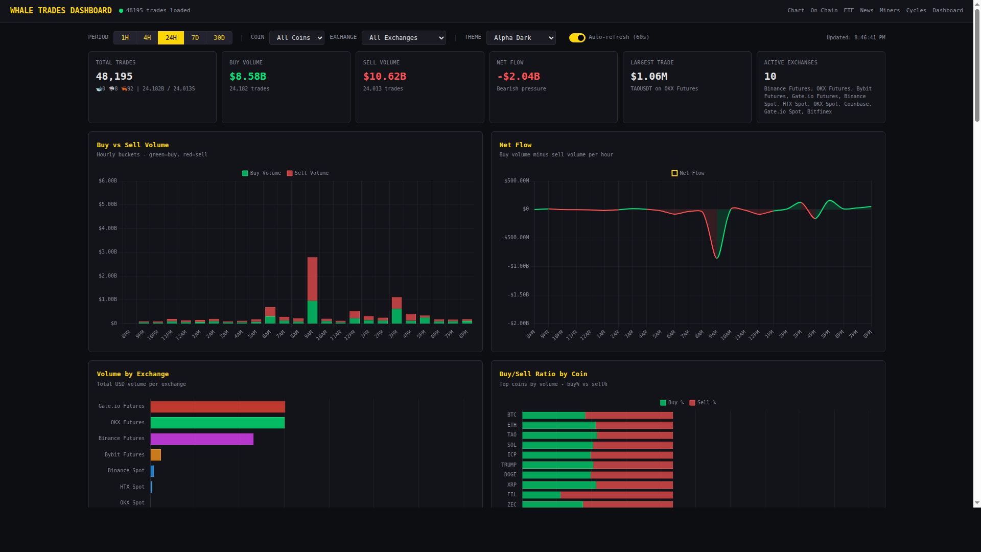
Monitor large executed trades across 8 major exchanges in real-time. Detect whale activity, volume spikes, and liquidation cascades.

  • Live whale trade alerts across Binance, Bybit, OKX, Coinbase, Gate.io, HTX, Bitfinex
  • Trade classification: 🐋 Whale (>$5M) / 🦈 Shark ($500K-$5M) / 🦐 Shrimp (<$500K)
  • Volume spike detection (Unusual buying/selling activity alerts)
  • Liquidation tracking with Long/Short breakdown per exchange
  • Forced liquidation correlation — detect when trades trigger liquidations
  • DT Long/Short Ratio, Open Interest, Commando Score, Funding Rate charts
  • Exchange breakdown with buy/sell/net flow comparison
  • Telegram & Discord alert bots for whale trades and liquidations
Open Trades Dashboard
Whale Trades Dashboard
Technology

Built for Performance

Every component is optimized for speed and reliability.

Custom Canvas Engine

Hardware-accelerated rendering with 60fps charting. No libraries — pure performance built from scratch.

🤖

AI-Powered Signals

Multi-indicator divergence detection with Claude & OpenAI confirmation for high-confidence trade signals.

Full Bitcoin Node

Own Bitcoin Core node for trustless on-chain analysis. UTXO scanning, block monitoring, address tracking.

📊

ClickHouse Analytics

High-performance columnar database for billions of data points. Sub-second queries across all metrics.

🔔

Multi-Channel Alerts

Price alerts via Telegram, Discord webhooks, push notifications, and native Android notifications.

📱

Native Android App

Full-featured Android app with background price monitoring, home screen widget, and native notifications.

Indicators

50+ Professional Indicators

Complete technical analysis toolkit covering every aspect of crypto market analysis. Click any indicator for full details.

Chart Overlay

📈 Moving Averages

SMA, EMA, WMA with configurable periods, colors, and crossover signals.

How it works: Plots smoothed price averages over a chosen period. SMA weights all prices equally, EMA reacts faster to recent prices, WMA emphasizes recent data even more.

How to use: Use shorter periods (9, 21) for entries and longer (50, 100, 200) for trend direction. Golden Cross (50 above 200) = bullish; Death Cross = bearish. Price bouncing off an MA confirms it as dynamic support/resistance.

Best for: Identifying trend direction, dynamic support/resistance, and crossover entry signals.

📈 SuperTrend

ATR-based trend direction with automatic buy/sell signal markers.

How it works: Uses ATR (Average True Range) to set a trailing stop above or below price. When price crosses the band, trend flips and a signal marker appears.

How to use: Green band below price = uptrend (hold longs). Red band above = downtrend (hold shorts). The flip point is your entry/exit signal. Increase the ATR factor for fewer false signals on higher timeframes.

Best for: Trend-following strategies with clear entry/exit points. Works best on 15m+ timeframes.

🌟 Alpha Prime

Support/Resistance levels, Market Sessions, VWAP Bands, Multi-TF VWAP.

How it works: All-in-one overlay combining VWAP (Volume Weighted Average Price) with standard deviation bands, automatic S/R level detection, and market session highlighting (Asia, London, NY).

How to use: VWAP is the "fair price" for the session — above = bullish, below = bearish. The bands act as take-profit zones. S/R levels show where price reversed before. Session boxes help identify which market is driving the move.

Best for: Intraday traders who need confluence from multiple overlays in one clean indicator.

🔱 Alpha Hades

EMA Crossover System (7, 25, 100, 200) with visual trend signals.

How it works: Plots 4 EMAs (7, 25, 100, 200) with colored fill between them. When fast EMAs cross slow EMAs, a colored cloud forms showing the trend direction.

How to use: Green cloud (7 > 25 > 100 > 200) = strong uptrend. Red cloud = strong downtrend. Narrowing cloud = weakening trend, prepare for reversal. Use the 200 EMA as the ultimate trend filter.

Best for: Quick visual trend identification across any timeframe. Great for filtering trade direction.

🎯 Alpha Predator

OBV + DEMA candle coloring for momentum-based trade signals.

How it works: Combines On-Balance Volume trend with Double EMA momentum. Candles are colored based on the combined signal — green when both OBV and DEMA are bullish, red when both bearish, neutral otherwise.

How to use: Trade in the direction of colored candles. Strong green sequences = momentum long. Mixed colors = choppy market, stay flat. Look for color transitions as early entry signals.

Best for: Momentum traders who want volume-confirmed directional bias at a glance.

🎯 Sniper Levels

VWAP/TWAP weekly support and resistance precision levels.

How it works: Calculates weekly VWAP and TWAP (Time Weighted Average Price) and plots them as high-probability support/resistance levels. These are institutional reference prices.

How to use: Price approaching weekly VWAP from below = potential resistance. Strong breakout above = bullish continuation. The levels are most powerful at the start of a new week when institutions rebalance.

Best for: Precision entries at institutional price levels. Combines well with order flow data.

📊 Volume Profile

Horizontal volume distribution by price — find high-volume nodes and value areas.

How it works: Shows volume traded at each price level as horizontal bars. The Point of Control (POC) is the price with the most volume. The Value Area covers 70% of traded volume.

How to use: POC acts as a magnet — price tends to return to it. Low-volume gaps are fast-move zones. High-volume nodes are S/R zones. Value Area High/Low serve as range boundaries.

Best for: Identifying real S/R based on actual traded volume, not just price patterns.

📊 Market Profile (TPO)

Time Price Opportunity chart showing time spent at each price level.

How it works: Displays how much time price spent at each level using letter blocks (TPOs). The more letters stacked, the more accepted that price is by the market.

How to use: Wide profiles = balanced/range day. Narrow profiles = trending day. Single prints (gaps in TPOs) get revisited. The Initial Balance (first hour) sets the day's range expectation.

Best for: Understanding market structure, auction theory, and day-type classification.

📋 Order Book V1

Real-time depth visualization with whale order detection.

How it works: Shows live bid/ask order depth as colored areas on the chart. Large orders (whale walls) are highlighted. Updates in real-time as orders are placed and cancelled.

How to use: Large bid walls = potential support (but can be spoofed). Watch for walls being pulled before price arrives — this is a trap. Thin areas in the book = fast moves through that zone.

Best for: Scalpers and short-term traders who need to see real-time order flow dynamics.

📖 Order Book V2

Historical orderbook footprint with lens magnification and bid/ask filtering.

How it works: Stores orderbook snapshots over time in ClickHouse and renders them as a footprint chart. Shows how the order book evolved — where liquidity built up and was consumed.

How to use: Areas where liquidity repeatedly builds = strong S/R. Use the lens tool to zoom into specific price zones. Filter by bid or ask side to see where the pressure is concentrated.

Best for: Analyzing historical order flow patterns and identifying recurring liquidity zones.

🌍 Market Overlay

Gold, S&P 500, DXY, Oil, and Bonds overlaid directly on the BTC chart.

How it works: Plots traditional market instruments (Gold, SPY, DXY, Oil, Bonds) as scaled overlay lines on the BTC chart for correlation analysis.

How to use: BTC often correlates inversely with DXY (Dollar Index) — rising DXY = BTC pressure. SPY correlation shows risk-on/risk-off sentiment. Gold divergence from BTC can signal regime changes. Watch for correlation breakdowns as leading signals.

Best for: Macro traders who need to see cross-market correlations in one view.

💎 Coinbase Premium

Coinbase vs Binance price spread showing US institutional buying pressure.

How it works: Calculates the percentage difference between Coinbase BTC price and Binance BTC price. Positive premium = US buyers paying more.

How to use: Sustained positive premium = strong US institutional demand (bullish). Negative premium = US selling pressure. Spikes during US trading hours are especially significant. This was a key signal during the 2021 bull run.

Best for: Gauging institutional US demand. Useful as a confirmation signal during rallies or selloffs.

📅 Economic Events

CPI, FOMC, NFP, GDP, PCE displayed as vertical markers on the chart.

How it works: Marks major economic data releases (CPI, PPI, FOMC decisions, Non-Farm Payrolls, GDP, PCE) directly on the chart as vertical lines with event details.

How to use: Avoid opening new positions right before high-impact events. The first reaction is often wrong — wait 15-30 minutes for the real move. Use past event reactions to understand how the market processes similar data.

Best for: Planning trades around macro events and understanding what caused past volatility spikes.

Liquidation Indicators

🔥 Liq Heatmap V1

2D time × price heatmap showing predicted liquidation density clusters.

How it works: Estimates where leveraged positions would be liquidated based on common leverage levels (5x, 10x, 25x, 50x, 100x) and plots them as a heat gradient over time.

How to use: Bright zones = heavy liquidation clusters. Price is magnetically attracted to these zones because market makers profit from triggering them. The brighter the zone, the higher the probability price will reach it. Plan entries after the sweep.

Best for: Predicting where price will go next based on liquidation magnets. Essential for futures trading.

🔥 Liq Heatmap V2

Enhanced heatmap built from real orderbook snapshots for higher accuracy.

How it works: Uses actual historical orderbook data stored in ClickHouse instead of estimates. Shows where real liquidation orders were stacked over time.

How to use: Same interpretation as V1 but with significantly higher accuracy since it uses real data. Compare V1 and V2 — when both agree on a level, it's a very high-probability target.

Best for: Professional-grade liquidation analysis with real exchange data backing every heat zone.

📊 Liq Levels V1

OI-based liquidation level projection with swept-level detection.

How it works: Projects liquidation price levels based on open interest at common leverage tiers. Marks levels that have already been swept (triggered).

How to use: Unswept levels above price = short liquidation targets. Below = long liquidation targets. Once a level is swept, it loses its magnetic pull. Multiple unswept levels stacked together create strong liquidation walls.

Best for: Setting take-profit targets based on where the next liquidation cascade will trigger.

📊 Liq Levels V2

Real data liquidation levels with long/short ratio and delta tracking.

How it works: Uses real exchange data to show liquidation levels with separate long and short components. Includes delta (long minus short liquidations) for net positioning.

How to use: When long liquidations far exceed shorts at a level, price drop to that level triggers a cascade. The delta shows which side is more vulnerable. Combine with funding rate — high positive funding + heavy long liquidation levels below = high risk of long squeeze.

Best for: Precision risk assessment using real liquidation data. Know exactly which side is more exposed.

💀 Liq Predictor

Predicts upcoming liquidation zones from OI, funding rate, and history.

How it works: Combines open interest concentration, funding rate extremes, and historical liquidation patterns to predict where the next cascade will happen.

How to use: High-risk zones are marked on the chart. When price approaches these zones during extreme funding, expect violent moves. The predictor is most accurate when OI is at local highs (lots of leverage to unwind).

Best for: Proactive risk management — know where the danger zones are before price gets there.

💥 Liquidations Live

Real-time liquidation feed showing forced closures as they happen.

How it works: Displays live liquidation events from exchanges as markers on the chart. Color indicates side (long/short), size indicates USD value.

How to use: Clusters of liquidations confirm a move is momentum-driven (cascading liquidations). If price reverses right after large liquidations, it means the weak hands have been flushed. A surge of liquidations at a support level often marks the local bottom (capitulation).

Best for: Real-time confirmation of liquidation cascades and capitulation events.

💥 Liq History

4 years of historical liquidation data with multiple visualization modes.

How it works: Stores 4+ years of liquidation data in ClickHouse. Offers dots, heatmap, bar chart, and cumulative delta views of historical liquidation events.

How to use: Cumulative delta shows the net trend of liquidations over time — if more longs are being liquidated, the market is trending bearish. Historical patterns show which price levels consistently trigger cascades. Compare current OI to past liquidation zones.

Best for: Long-term liquidation pattern analysis and understanding market structure through the lens of forced closures.

RSI Variants

RSI

Classic RSI with overbought/oversold zones and divergence detection.

How it works: Measures the speed and magnitude of recent price changes on a 0-100 scale. Above 70 = overbought, below 30 = oversold. Includes automatic bullish/bearish divergence detection.

How to use: In trends, use OB/OS as continuation signals (buy the dip to 30 in an uptrend). In ranges, fade the extremes. Divergences (price makes new high but RSI doesn't) are the most powerful reversal signals. Hidden divergences confirm trend continuation.

Best for: Identifying overbought/oversold conditions and catching early reversal signals via divergences.

RSI2

RSI with integrated backtesting parameters for strategy validation.

How it works: Same RSI calculation but with built-in signal parameters (OB/OS levels, divergence pivot length, max bars) that connect directly to the AI auto-trading backtester.

How to use: Adjust the parameters and immediately see how they would have performed historically. Optimize the period, OB/OS thresholds, and divergence settings for your trading style and timeframe.

Best for: Traders who want to validate and optimize their RSI strategy before using it with auto-trading signals.

RSI Alpha

Advanced RSI with moving average, cloud, Bollinger Bands, and divergence overlays.

How it works: Enhanced RSI with multiple visualization layers: RSI moving average for trend, BB bands for RSI volatility, gradient cloud fill, and divergence markers.

How to use: RSI above its MA = bullish momentum. RSI hitting the upper BB = extreme that often mean-reverts. The cloud fill gives instant visual trend context. Use divergences from this RSI for higher-confidence reversal signals.

Best for: Traders who want maximum information from their RSI without needing multiple separate indicators.

🧠 RSI AI

Early divergence detection at pivot points with velocity filter.

How it works: Uses a predictive algorithm to detect divergences while they're still forming, before the second pivot completes. A velocity filter reduces false signals by requiring minimum RSI rate-of-change.

How to use: Yellow markers show forming divergences — these are early warnings, not confirmed signals. Wait for price action confirmation (break of structure, candle pattern) before entering. The velocity filter strength can be tuned in settings.

Best for: Getting early alerts for potential divergences so you can prepare your trade before the crowd sees it.

Volume RSI (VRI)

Volume-weighted RSI oscillator combining price momentum with volume confirmation.

How it works: Applies the RSI formula to volume data instead of price. When volume RSI is high, buying volume dominates; when low, selling volume dominates.

How to use: Price RSI diverging from Volume RSI = weak move likely to fail. Both RSIs in agreement = strong move likely to continue. Volume RSI hitting extremes during price consolidation signals an imminent breakout.

Best for: Volume confirmation of price momentum. Catching moves where the volume doesn't support the price action.

Oscillators & Momentum

📊 MACD

Convergence/Divergence with histogram, signal line, and divergence detection.

How it works: Calculates the difference between fast and slow EMAs (default 12, 26). The signal line (9 EMA of MACD) generates crossover signals. The histogram shows momentum acceleration/deceleration.

How to use: MACD crossing above signal = bullish. Histogram growing = momentum increasing. Histogram shrinking = momentum fading even if price is still moving. MACD divergences from price are powerful reversal signals.

Best for: Measuring trend momentum and identifying momentum shifts before price reverses.

💪 ADX

Average Directional Index for trend strength with +DI/-DI directional indicators.

How it works: ADX measures trend strength (0-100) regardless of direction. +DI measures upward pressure, -DI measures downward pressure. ADX above 25 = trending, below 20 = ranging.

How to use: Only use trend-following strategies when ADX > 25. Switch to mean-reversion when ADX < 20. +DI crossing above -DI = bullish trend starting. Rising ADX with rising price = strong uptrend strengthening.

Best for: Deciding whether to use trend-following or mean-reversion strategies based on market conditions.

📊 ATR

Average True Range measuring market volatility across timeframes.

How it works: Calculates the average range of price movement over N periods, including gaps. Higher ATR = more volatile market.

How to use: Use ATR to size stops — 1.5-2x ATR is a common stop distance. Rising ATR during a move = increasing conviction. Falling ATR = move is exhausting. Compare current ATR to historical average to know if volatility is above or below normal.

Best for: Proper position sizing, stop-loss placement, and volatility-adjusted risk management.

📊 OBV

On-Balance Volume tracking cumulative buying/selling pressure.

How it works: Adds volume on up-candles and subtracts volume on down-candles, creating a cumulative total. The direction of OBV shows which side is accumulating.

How to use: OBV rising while price is flat = accumulation (bullish). OBV falling while price holds = distribution (bearish). OBV divergences from price are very reliable reversal signals. OBV breakout before price breakout is a leading indicator.

Best for: Detecting accumulation/distribution before price reflects it. One of the best volume-based leading indicators.

📊 CVD Spot

Cumulative Volume Delta showing net buying vs selling volume.

How it works: Tracks the cumulative difference between taker buy volume and taker sell volume over time. Rising CVD = buyers are aggressive; falling = sellers are aggressive.

How to use: Price rising + CVD rising = healthy rally. Price rising + CVD falling = rally is being sold into (bearish divergence). CVD dropping sharply then flattening at a low = selling exhaustion, potential bottom.

Best for: Understanding whether price moves are driven by aggressive buying or selling. The purest measure of order flow.

🔮 DMS

Divergence Momentum Score — pressure lines predicting formations before they complete.

How it works: Calculates divergence pressure across multiple oscillators simultaneously (RSI, MACD, OBV) and shows a composite score. Predicts divergences before the second pivot forms.

How to use: High DMS score = divergence is building, reversal likely. The score rises as more oscillators show divergence simultaneously. Use as an early-warning system and confirm with price action.

Best for: Multi-indicator divergence detection in a single view. Catches reversals that single-indicator analysis would miss.

🔥 MTF Confluence

Multi-timeframe agreement detection across indicators and periods.

How it works: Analyzes the same indicators across multiple timeframes (5m, 15m, 1h, 4h, 1d) and produces a confluence score. Higher score = more timeframes agree on direction.

How to use: Only take trades when MTF score is high (3+ timeframes aligned). The direction with the highest confluence is your bias. When confluence drops to zero = mixed signals, stay flat. Perfect for filtering out low-probability setups.

Best for: Avoiding trades that look good on one timeframe but are against the trend on higher timeframes.

Funding Rate & Open Interest

📊 Funding Rate

Perpetual futures funding rate histogram for sentiment analysis.

How it works: Shows the funding rate paid between long and short positions on perpetual futures. Positive = longs pay shorts (bullish sentiment). Negative = shorts pay longs (bearish sentiment).

How to use: Extreme positive funding (>0.05%) = overheated longs, expect correction. Extreme negative = excessive fear, contrarian long opportunity. Funding flipping from positive to negative during a dip = fear cascade, often marks bottoms. Use as a contrarian indicator at extremes.

Best for: Gauging market sentiment and finding contrarian opportunities when positioning is extreme.

📊 Funding Score

Normalized 0-100 score highlighting carry trade extremes.

How it works: Normalizes the raw funding rate into a 0-100 oscillator. Accounts for the historical distribution of funding to identify true extremes vs normal fluctuation.

How to use: Score above 80 = extremely overheated longs (contrarian short signal). Below 20 = excessive shorting (contrarian long). Between 40-60 = neutral, no edge from funding. Combines well with OI data for full derivatives picture.

Best for: Quick-glance funding analysis without needing to interpret raw basis point values.

📊 Open Interest

OI, OI Change %, Vol/OI ratio, Long/Short Ratio, and Funding Rate combined.

How it works: All-in-one derivatives dashboard showing open interest in USD, percentage change, volume-to-OI ratio, long/short positioning ratio, and funding rate in a single sub-panel.

How to use: Rising OI + rising price = new money entering longs (bullish). Rising OI + falling price = new shorts opening (bearish). Falling OI = positions closing (deleverage). Vol/OI ratio spikes signal high activity relative to positions — expect volatility.

Best for: Complete derivatives market overview. The most important indicator for understanding leverage and positioning.

⚖️ Bid/Ask Ratio

Real-time bid vs ask volume imbalance across the order book.

How it works: Calculates the ratio of total bid volume to ask volume at 2% depth from mid-price. Ratio >1 = more bids (buying pressure). <1 = more asks (selling pressure).

How to use: Sustained bid > ask = support building, price likely to rise. Sharp flip from bid-heavy to ask-heavy = sellers entering, potential top. Use in conjunction with price action — if price is falling but bids are growing, smart money may be accumulating.

Best for: Real-time order flow analysis. Best used on shorter timeframes for intraday trading decisions.

📊 Options Summary

Put/Call ratio, max pain, implied volatility, and key strike levels.

How it works: Aggregates options data from Deribit showing the put/call OI ratio, max pain price (where most options expire worthless), and implied volatility levels.

How to use: Max pain is a magnetic target before monthly/quarterly expiry. P/C ratio above 1 = bearish hedging (often contrarian bullish). Rising IV = market expects a big move. IV dropping after an event = "vol crush" — good for selling premium.

Best for: Understanding options market positioning and expiry-driven price targets.

Whale & Positioning

🐳 Whale/Retail Delta V1

Binance whale vs retail position delta with aggregated exchange data.

How it works: Shows the difference between whale (top trader) positioning and retail positioning from Binance. Positive delta = whales are more long than retail.

How to use: Follow the whales — when whale delta diverges from retail, whales are often right. Whales loading longs while retail shorts = bullish setup. Whales reducing exposure while retail goes long = danger sign.

Best for: Identifying smart money positioning and fading retail crowd behavior.

🐋 Whale/Retail Delta V2

Enhanced version with Binance + HyBlock historical data from ClickHouse.

How it works: Combines Binance whale data with HyBlock cross-exchange aggregated positioning data. Full historical data from ClickHouse enables long-term analysis.

How to use: Same as V1 but with broader exchange coverage and historical depth. Look for whale delta extremes on the 4h+ timeframe for higher-conviction signals. Sustained whale long delta = accumulation phase.

Best for: Comprehensive whale positioning analysis with multi-exchange data and deep history.

🐋 Whale Position Dominance

Concentration score tracking when whales are actively loading positions.

How it works: Calculates the percentage of total open interest held by whale accounts (top traders). Rising dominance = whales are concentrating positions.

How to use: Rising dominance + rising price = whales loading longs aggressively (very bullish). Rising dominance + flat price = accumulation in progress, move coming soon. Dropping dominance = whales taking profit, be cautious.

Best for: Detecting whale accumulation/distribution phases before they're visible in price.

⚖️ Long/Short Global

Aggregated Long/Short ratio across multiple exchanges with prediction model.

How it works: Aggregates the long/short ratio from Binance, OKX, and other major exchanges into a single global metric. Includes a prediction model for upcoming shifts.

How to use: Extreme long ratio (>1.5) = too many longs, contrarian short. Extreme short ratio (<0.7) = too many shorts, contrarian long. The prediction line shows where the ratio is heading, giving you advance notice of sentiment shifts.

Best for: Contrarian trading based on global positioning data. Most effective at extremes combined with funding rate analysis.

DecentTrader Suite

🎯 DT Commando

Composite score from funding, OI, and long/short across all timeframes.

How it works: DecentTrader's proprietary Commando Score combines funding rate, open interest changes, and long/short ratio into a single directional score. Ranges typically from -3 (extreme bearish) to +3 (extreme bullish).

How to use: Score above +2 = extreme bullish positioning (contrarian caution). Below -2 = extreme bearish (contrarian long opportunity). Use the trend of the score (rising/falling) for momentum direction. Best on 1h-4h timeframes.

Best for: Quick derivatives sentiment snapshot. One number that tells you how the futures market is positioned.

💰 DT Funding Rate

Historical funding rate with weighted cross-exchange aggregation.

How it works: Shows the historical funding rate from DecentTrader's weighted multi-exchange aggregation. More accurate than single-exchange funding as it accounts for exchange volume differences.

How to use: Same interpretation as standard funding rate but with higher reliability. The historical view shows how funding evolved during past trends — learn the patterns that preceded major moves.

Best for: Historical funding analysis with cross-exchange accuracy. Essential for backtesting funding-based strategies.

📊 DT Open Interest

Historical open interest with weighted aggregation across exchanges.

How it works: Aggregated open interest from multiple exchanges weighted by volume. Full historical data from ClickHouse enables year-over-year comparison.

How to use: Compare current OI to historical levels. OI at all-time highs = maximum leverage in the system (explosive move coming). OI at lows after a crash = leverage flushed, safe to re-enter. OI trend is more important than absolute value.

Best for: Long-term open interest analysis with reliable multi-exchange data.

⚖️ DT Long/Short

Long/Short ratio history with weighted cross-exchange aggregation.

How it works: Historical long/short ratio from DecentTrader's weighted aggregation. Shows how positioning evolved across timeframes with full ClickHouse history.

How to use: Plot alongside price to see how L/S extremes corresponded with tops and bottoms. The most reliable reversal signal is L/S reaching an extreme while price makes a new high/low (divergence between positioning and price).

Best for: Historical positioning analysis and identifying contrarian setups based on crowd behavior.

AI & Alpha Signals

🧠 Alpha Brain

BB Trailing Stop with Take-Profit/Stop-Loss system using Bollinger Bands.

How it works: Uses Bollinger Bands as a dynamic trailing stop system. When price breaks above the upper band, it sets a trailing stop at the middle band. Take-profit and stop-loss levels are calculated from ATR.

How to use: Enter when price breaks the upper BB with volume confirmation. Trail your stop using the middle BB. TP targets are set at 1x, 2x, 3x ATR from entry. The system automatically adjusts to volatility — wider bands = wider stops.

Best for: Automated trailing stop system that adapts to volatility. Works well on 15m-4h for swing trades.

🔮 Alpha Intelligence

Composite market intelligence score from 6 data sources with 4+ years of history.

How it works: Combines Open Interest trend, Funding Rate, Long/Short Ratio, Taker Buy/Sell Delta, Orderbook Imbalance, and Big Trades Bias into a single directional score (-100 to +100). Pre-computed every 5 minutes and stored in ClickHouse with 4+ years of backfill.

How to use: The histogram shows the score over time. Green = bullish composite, red = bearish. The data table shows each component's individual contribution. Use as a confluence filter — only take trades when the composite aligns with your technical analysis.

Best for: Multi-source market intelligence in one view. Saves time from checking 6 different data sources separately.
Mobile

Take It With You

Native Android app with background alerts, home screen BTC widget, and the full trading terminal in your pocket.

Download for Android
APK v2.5.0 • Requires Android 8.0+